NASA redesign
BADAS5. magazine
Word Nerd
Elysian Canon Distilleries
Savannah Children’s Choir
Propter Amorem Legendi
Silk & Stone
Fitz + The Tantrums
ibu x Artisan Alliance
Grab a link!


BACK TO TOP
Corien Erickson was here
jack of all trades
graphic designer

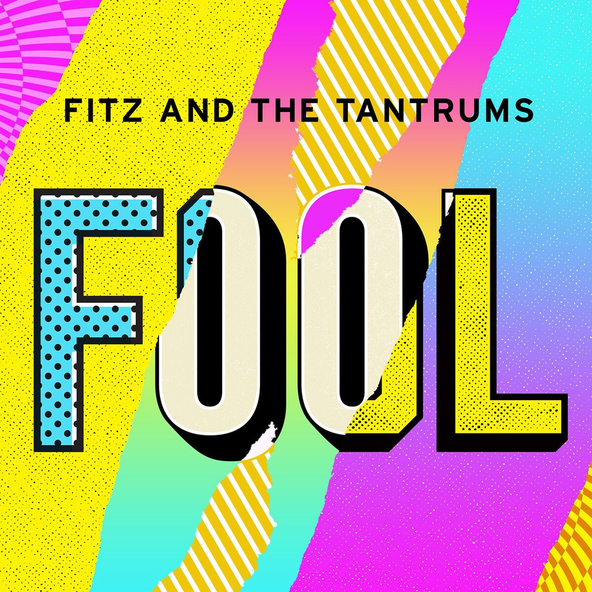
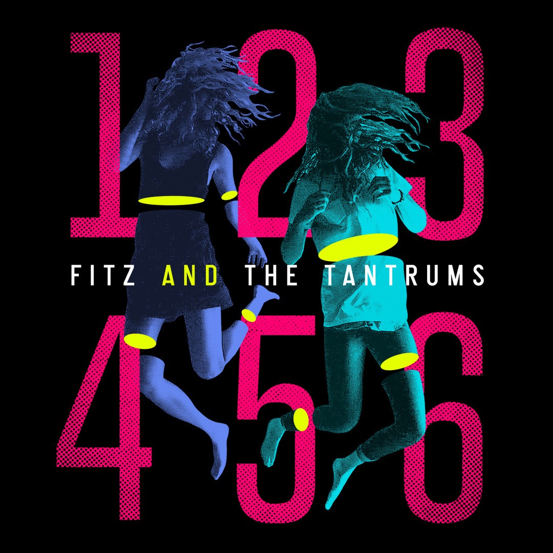
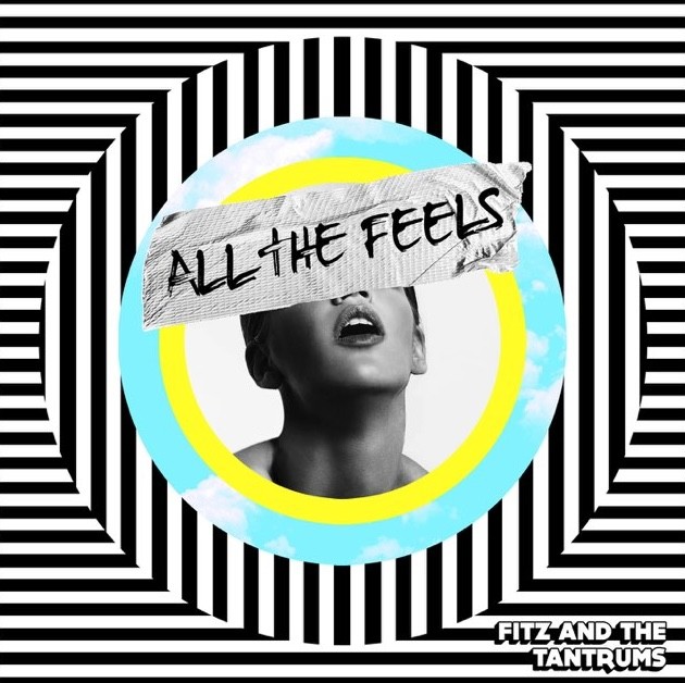
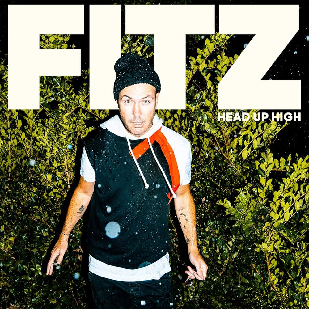
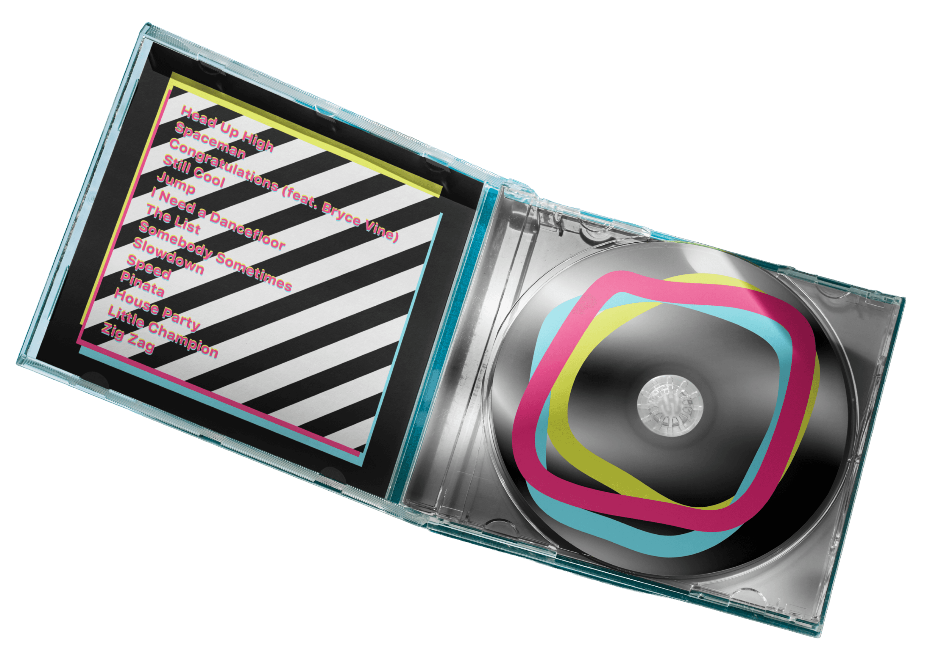
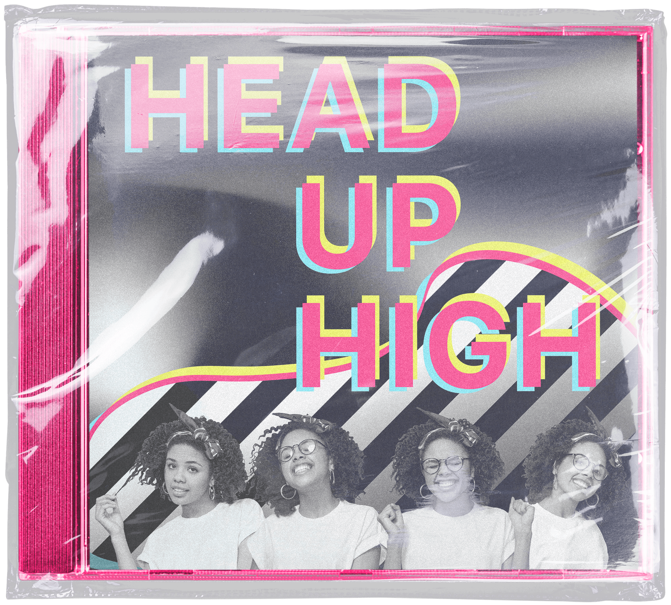
Head Up High, the debut album of Fitz, the frontman of Fitz and The Tantrums. Released in 2020, it was meant to bring an upbeat energy to what was for many, a depressing time.
I don’t personally have any great connection to the album or the lead singer, but the band is one I grew up listening to, and it saddened me to see something from them that looked decades older than it was.
For this project, I wanted to give it an identity that fit better with the rest of the band’s work. Their album covers are a collection that I’ve appreciated for the fun atmosphere and bright colors. I wanted to carry that energy into this album, more than focusing on creating something new for Michael Fitzpatrick (who we’re only just beginning to get to know outside of the context of the band).
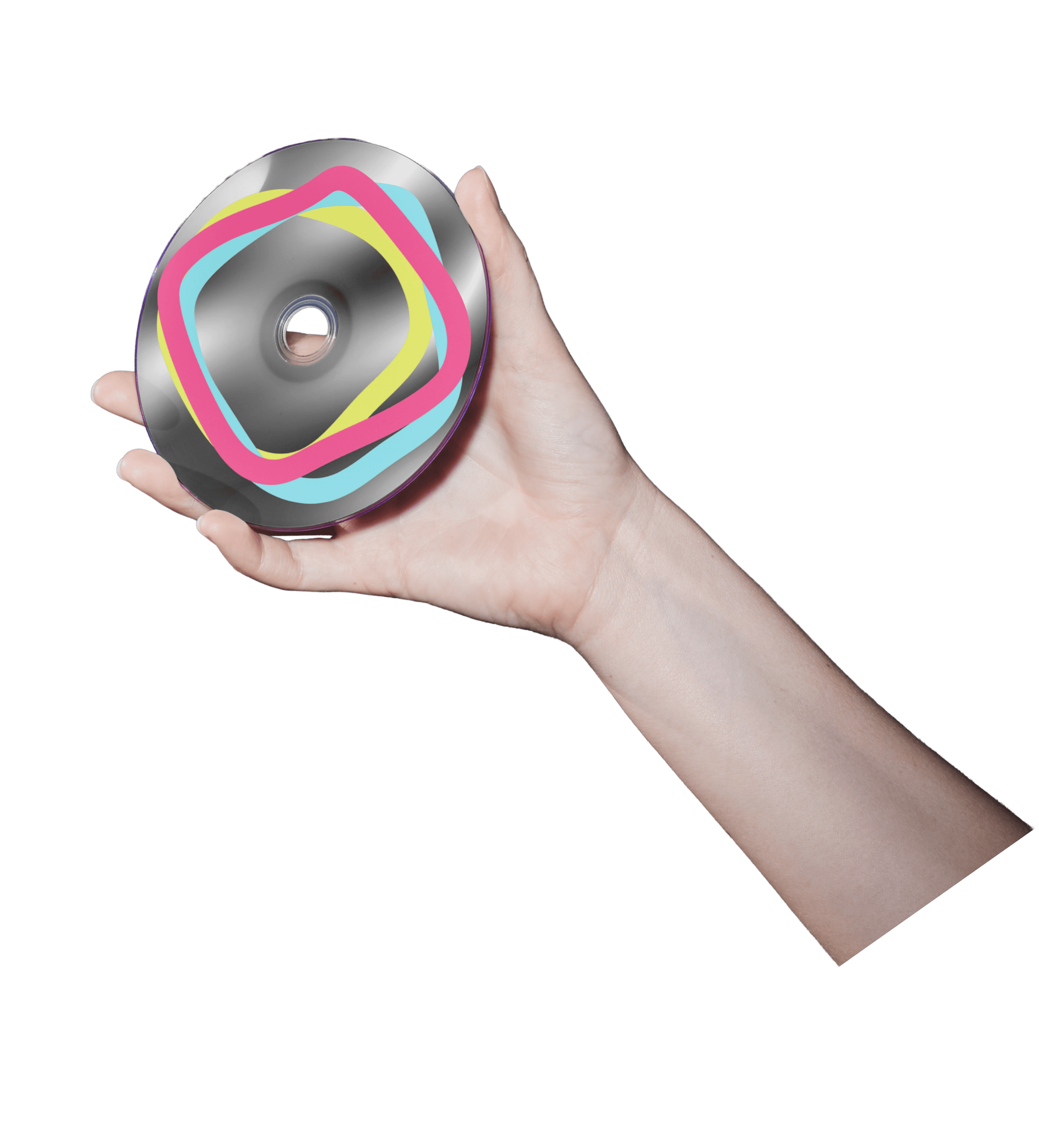
I hope you enjoy my take on the cover, CD,
and concert details!
THE RESEARCH
The initial prompt was to redesign an album cover, so I took one that stuck out as incohesive among the better designed albums.
From this research, I gathered pattern and color use that would better tie together the albums.
Some of the albums from the research are displayed below.
THE NEW DESIGN
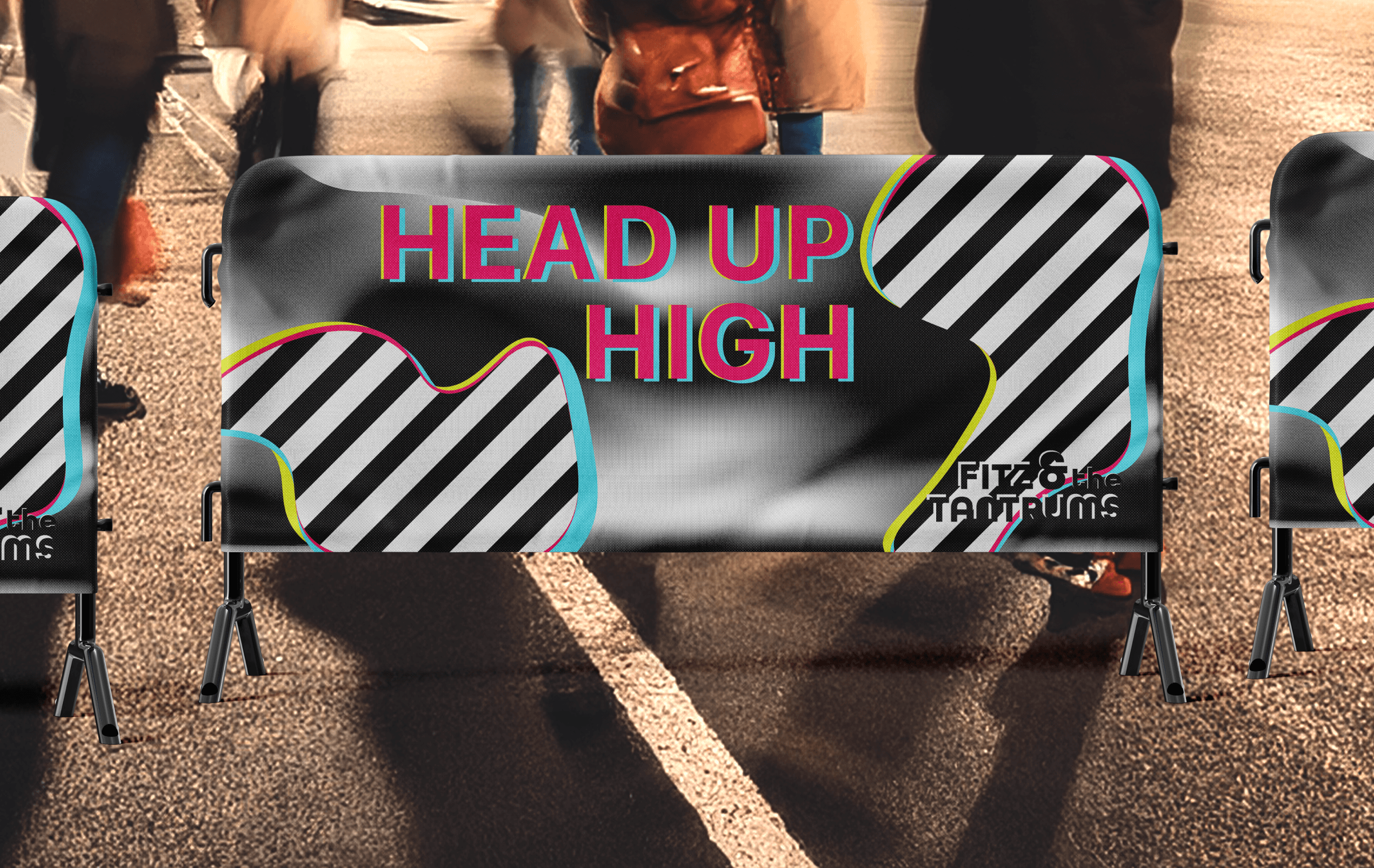
Using that color palette, I developed a 3D or glitch inspired overlap to carry the bright colors, while grounding it with a dynamic black and white pattern. My research also concluded that many of their albums incorporated people, so I sourced a set of bouncy and fun photographs from one model to give that human aspect to the identity.
THE MERCH
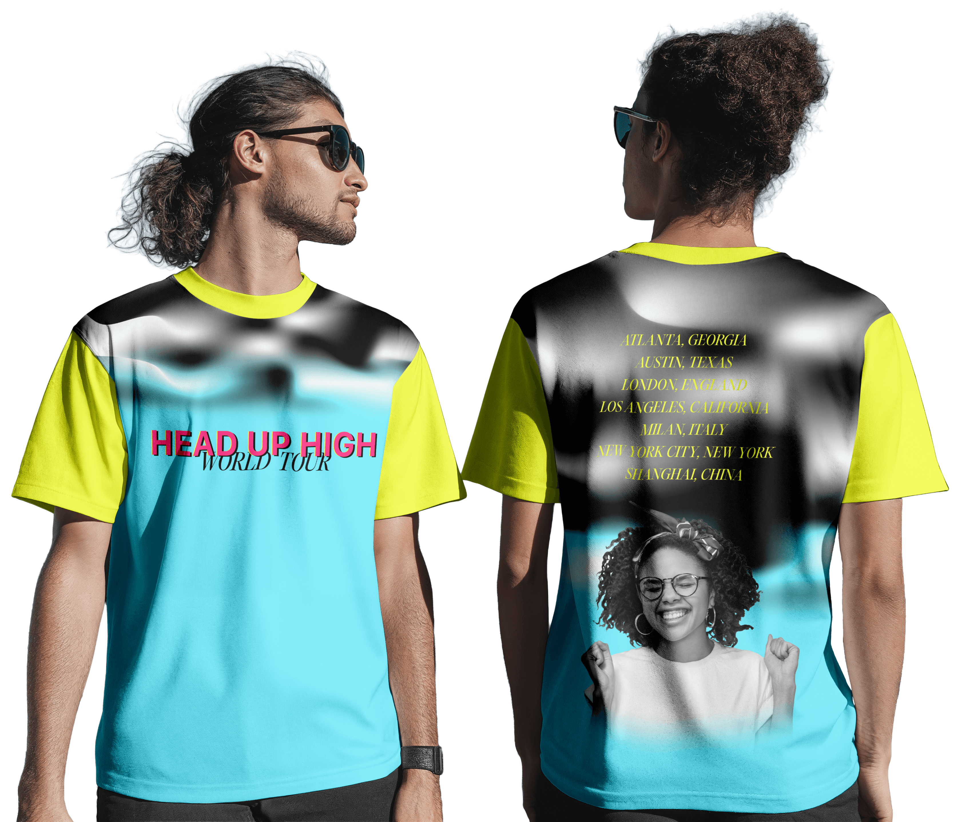
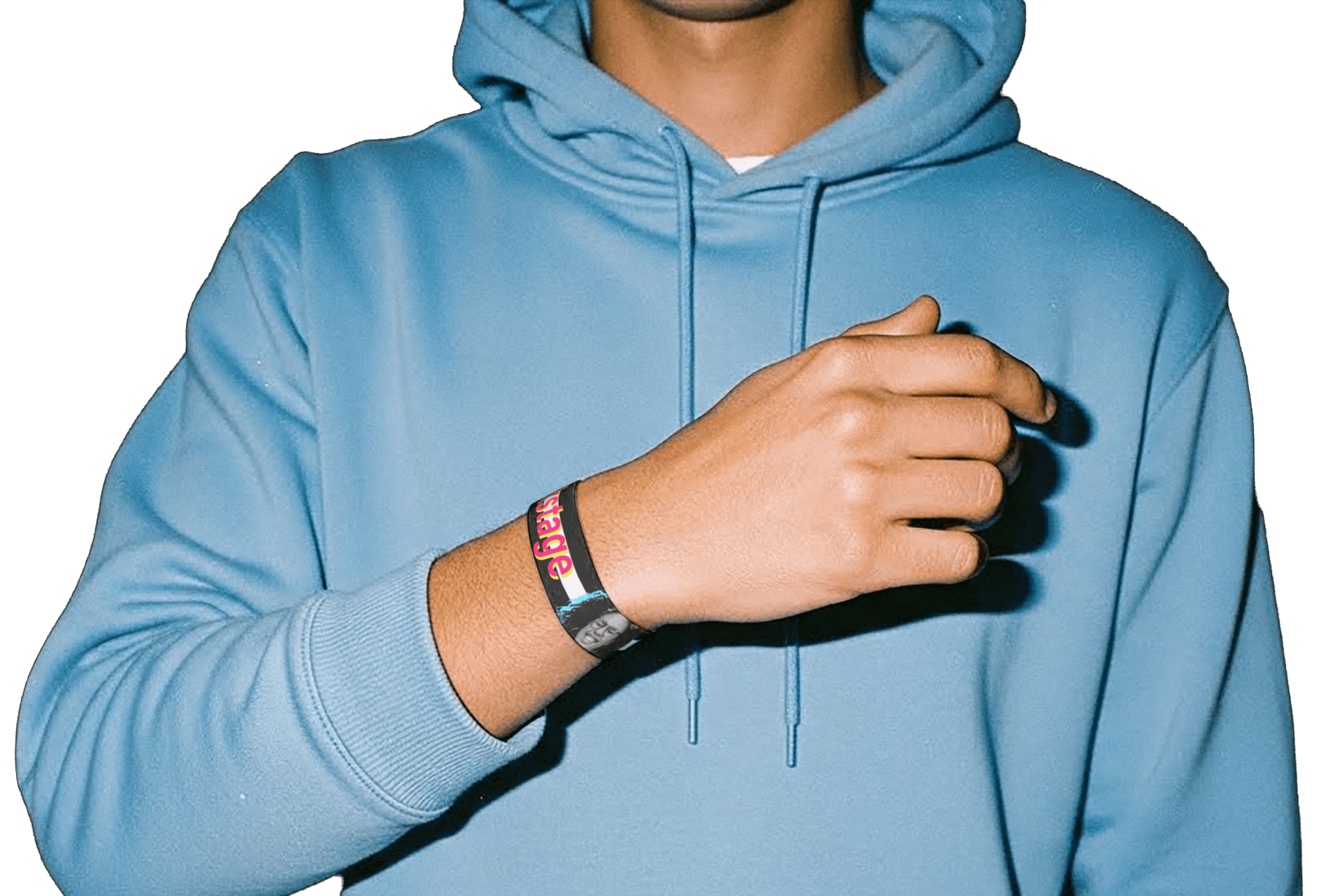
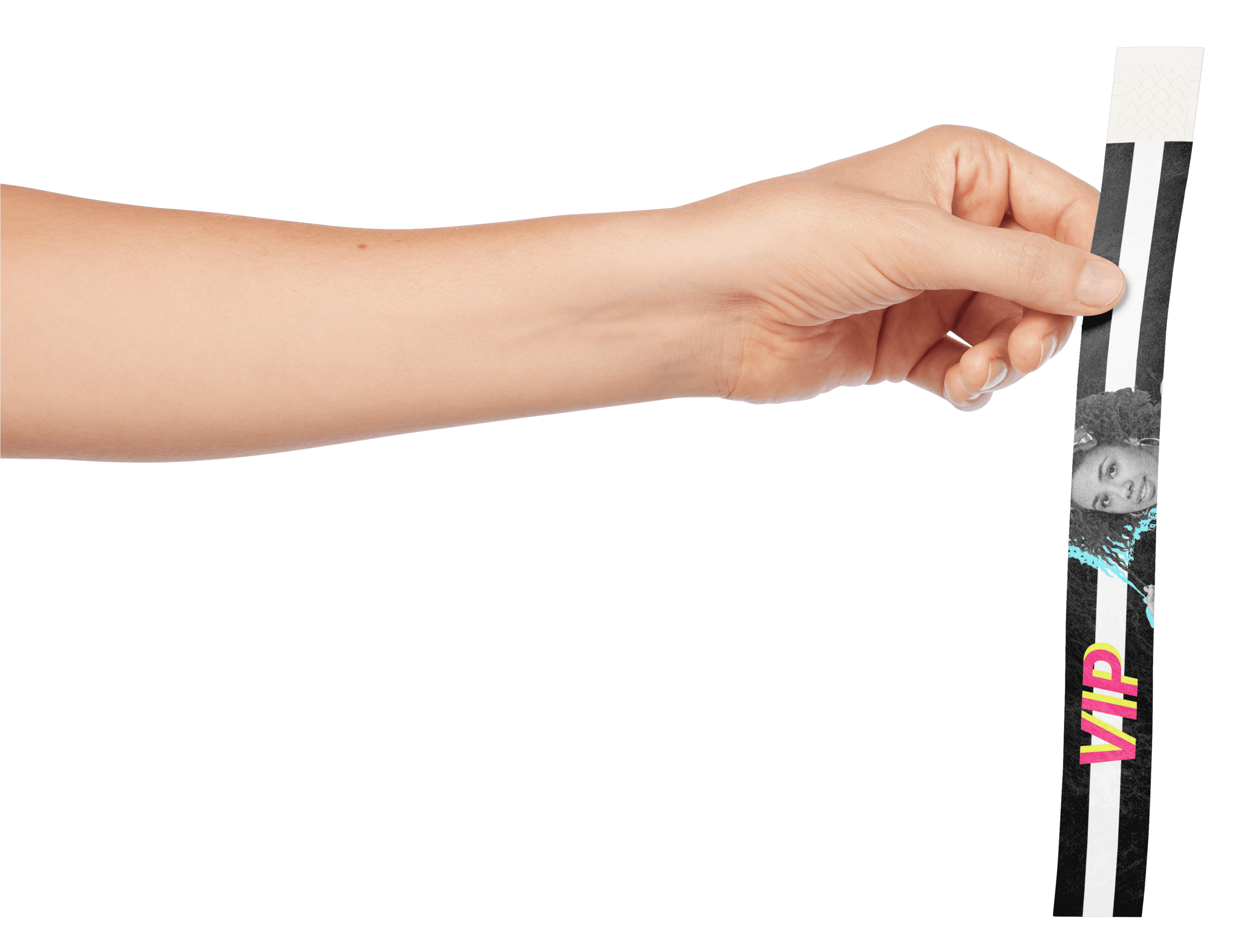
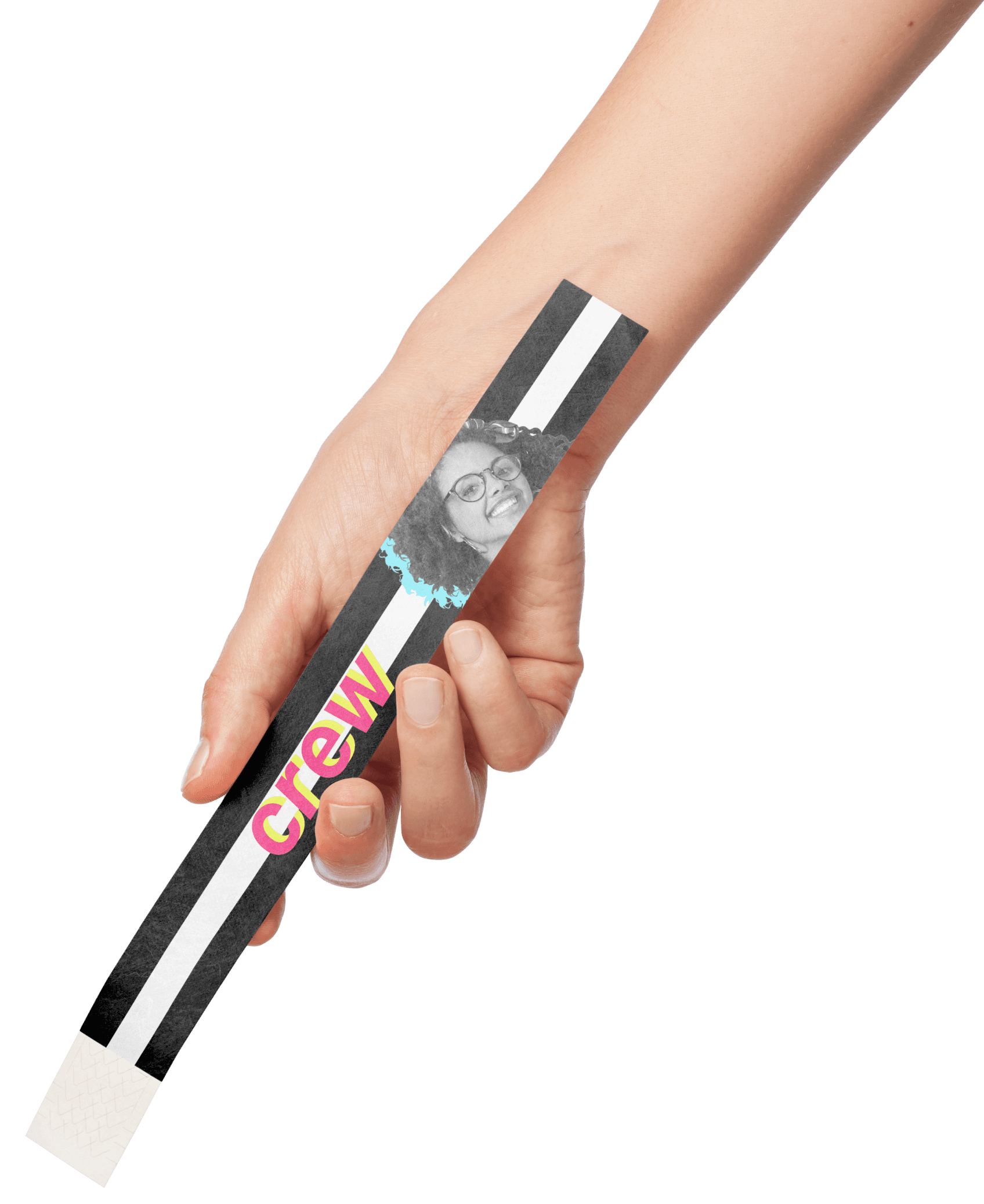
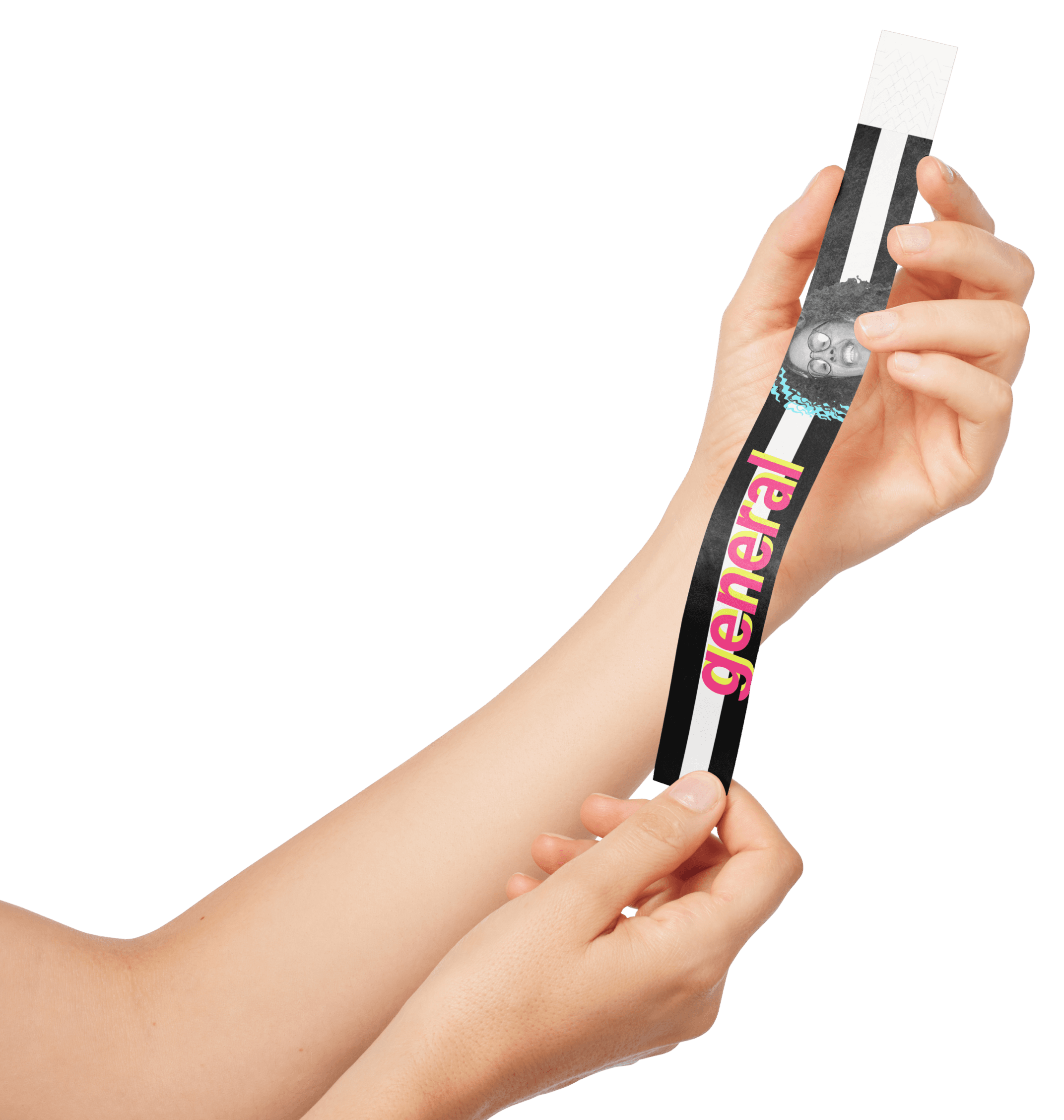
With a lack of super artistic assets, I wanted to highlight the parts that the concert goers would have interacted with. Aside from the partially colored mesh theyy would have seen during the concert, the typeface used for the tickets was not used very much outside of the concert assets, so I wanted to elevate that into the wearable take-home. I also wanted to include our model to bring the human aspect full circle in the identity.
THE CONCERT
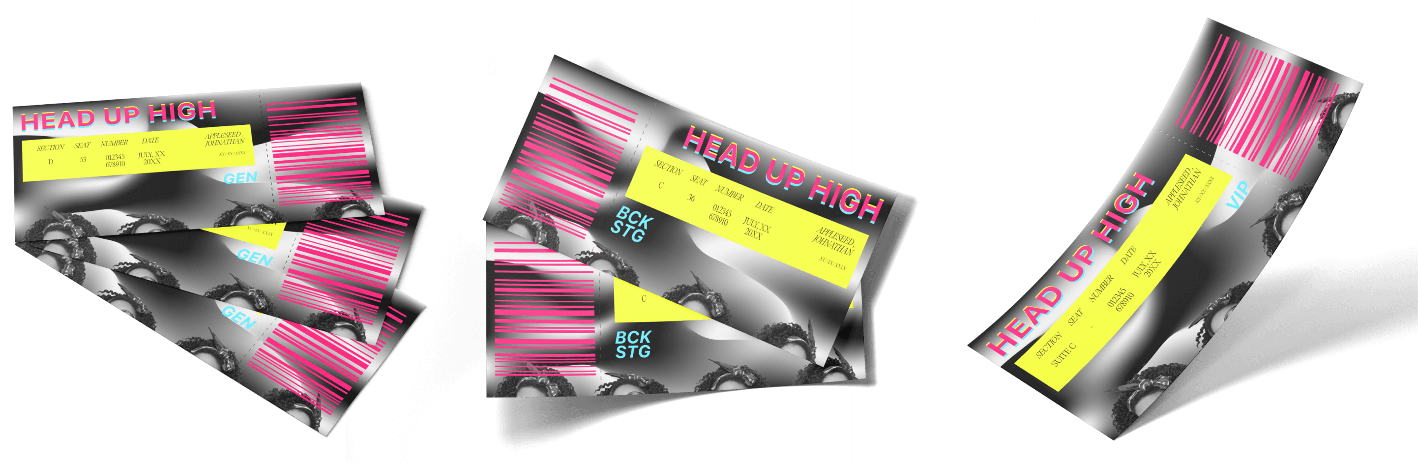
I wanted each piece to be easily recognizable, assuring the viewer that they were in the right spot and had the right wristband and ticket. I don’t have much experience at real life concerts, so I did my best based on examples online and my experience with airplane tickets.
A big part of that for me was to make sure that checking status and placement was clear and easy. I wanted the wristbands to clearly identify what areas the person is allowed into, without making a huge deal about who spent more money. The tickets received similar treatment, with the important information stated as easily as possible (including age, in case alcoholic beverages are served), and acknowledge the customers’ access status without making it glaringly obvious.
The perforation is also carefully positioned so that the customers’ ticket is still an aesthetic keepsake after the barcode is torn off.
THE STAGE
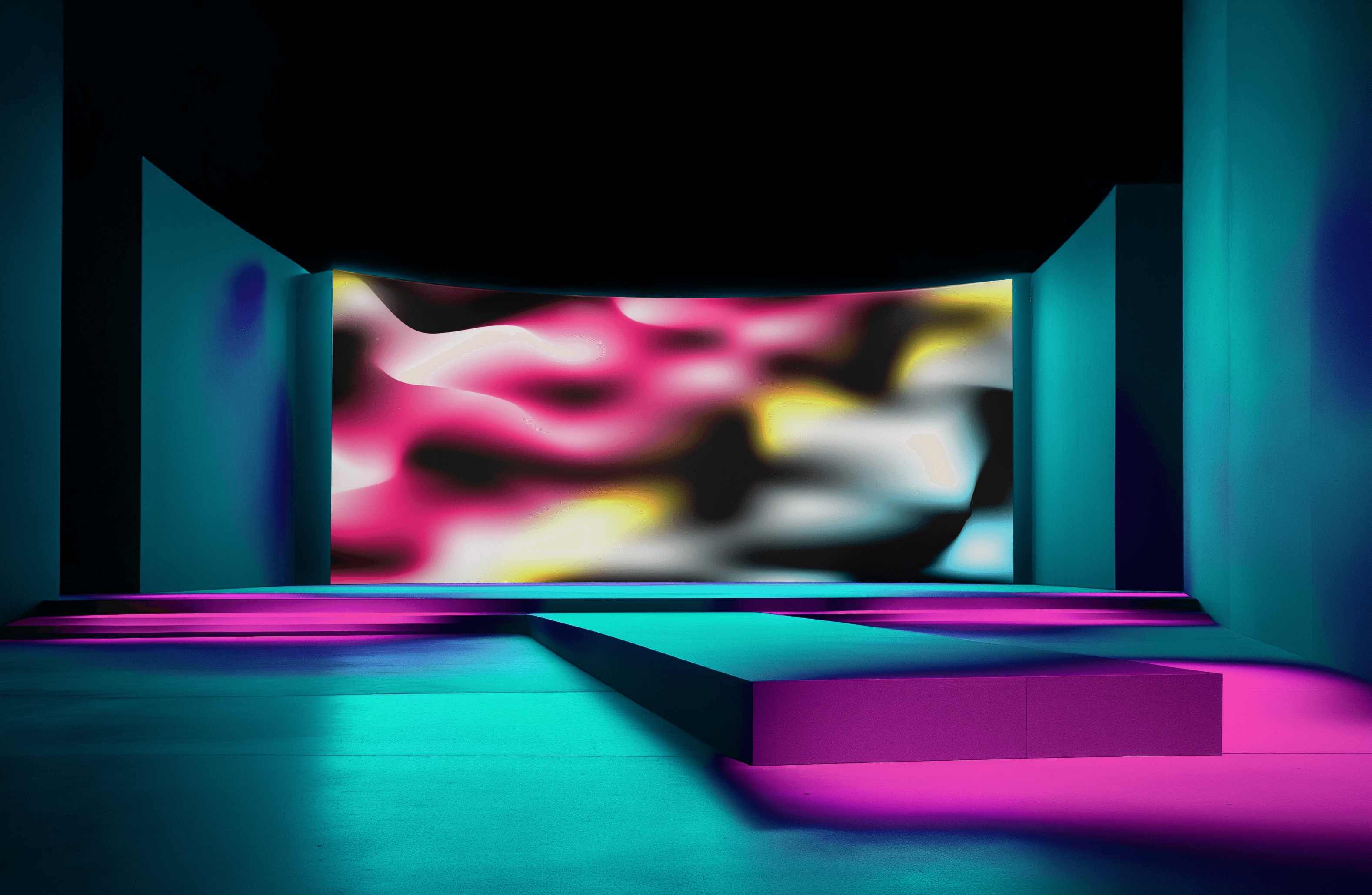
My goal for the stage screen was to create something dynamic that was strongly tied to the identity but new enough that it would be cool for the viewers, as well as interesting without drawing attention away from the performing artists.